|
Vibrant front features a cheesy deep-dish pizza with Domino’s branding, playful mascot, and contact info, highlighting flavor and quick delivery in the Twin Cities. |
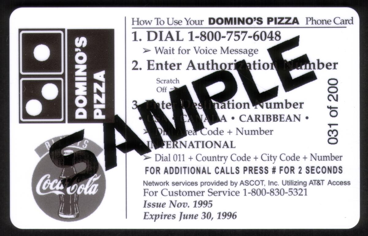
5m Domino's Pizza With Coca-Cola Coke Logos & Noid. # SAMPLE
Add to Cart
Click on any image to view a larger version.
| SKU |
|
Mfg |
|
Issued |
|
Price |
|
| 11860 |
|
ASC |
|
200 |
|
$17.99 |
| 5m Domino's Pizza With Coca-Cola Coke Logos & Noid. # SAMPLE |
Description:(This description is AI generated and may contain inaccuracies.)
This collectible phone card features a prominently displayed image of a Domino’s Deep Dish Pizza with a slice being lifted to reveal melted, stretchy cheese. The pizza is described with phrases emphasizing its quality and flavor: "ULTRA-THICK. ULTRA-ZESTY. ULTRA-ULTRA GOURMET." The card promotes Domino’s pizza and Coca-Cola, with the Coca-Cola logo shown twice—once as a bottle cap image and once with a six-pack of Coke cans.
The card includes key Domino’s slogans in bold, colorful text: “GOTTA BE GOOD” stacked vertically on the left side and “GOTTA BE DOMINO’S” positioned nearby. A clock icon shows "5 Minutes," referring to delivery speed. The text at the bottom provides a contact phone number, 835-3535, for all Twin Cities Domino’s locations.
An animated red Coca-Cola cup character wearing white gloves appears near the bottom right corner alongside a speech bubble saying “SERIOUSLY DELICIOUS!” The overall design emphasizes Domino’s pizza paired with Coca-Cola as the ultimate meal choice.
Since we have the world's largest inventory of USA phonecards for collectors, you will not necessarily receive the identical serial/batch/PIN number that we have scanned/pictured.
|
Keywords:
Coca Cola, cocacola, restaurants, dominos, gotta be good, our ultimate pizza, domino's deep dish pizza, coke cans, 6-pack, ultra-thick, ultra-zesty, ultra gourmet, food, twin cities locations, always coca-cola, gotta be domino's, KLZ-3165, Ascot, Inc.
|
|
|