|
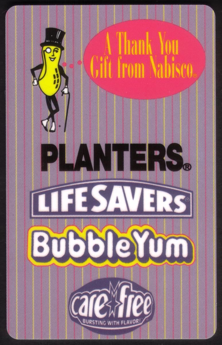
Vertical striped purple and gray background with Mr. Peanut, colorful brand logos, and a pink speech bubble, emphasizing Nabisco''s snack and candy portfolio. |
10m Nabisco: Planters Peanuts, Bubble Yum, LifeSavers, Etc. (2nd Ed)
Add to Cart
Click on any image to view a larger version.

| SKU |
|
Mfg |
|
Issued |
|
Price |
|
| 12707 |
|
DLT |
|
500 |
|
$15.59 |
Description:(This description is AI generated and may contain inaccuracies.)
This collectible card features prominent corporate logos and trademarks from well-known food and candy brands. Displayed are the LifeSavers logo in bold letters with the tagline “bursting with flavor” underneath, along with the Nabisco logo positioned nearby. The card also showcases the Planters Peanuts brand on the left side, showing its classic script and iconic nut mascot. Bubble Yum branding is also visible, adding to the assortment of recognizable snack and candy names represented on this card.
The card is designed as a promotional thank you gift from Nabisco, emphasizing a carefree and enjoyable theme. The presentation highlights a vibrant and colorful design, reflecting the lively and playful nature of these well-known brands. The card celebrates the collaboration between these snack and candy lines, grouping them together under the Nabisco banner, suggesting a focus on delicious treats and consumer appreciation.
This card’s graphics and trademarks are set against a clean background, making each brand’s logo and colors stand out clearly. The textual elements along with the corporate logos of Planters Peanuts, LifeSavers, Bubble Yum, and Nabisco create a unified display that reflects brand recognition and promotional intent. The card is connected to Nabisco’s promotional campaigns, making it a collectible item associated with corporate advertising efforts.
Since we have the world's largest inventory of USA phonecards for collectors, you will not necessarily receive the identical serial/batch/PIN number that we have scanned/pictured.
|
Keywords:
Promotional, Corporate logos, corporate trademarks, advertisements, advertising, brand names, candy, foods, bursting with flavor, a thank you gift from nabisco, carefree, care free, life savers, DeltaCom
|
|
|