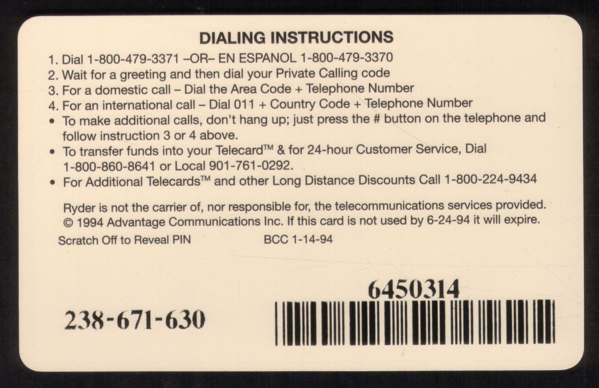
Total Items For Sale: 23425
        Search Help
My Cart: 0 Items


Bright yellow Ryder truck with water reflection, blue sky backdrop, and clear branding, emphasizing reliability and professional moving services.

20u Ryder Truck Rental. Thin Black Barcode. EasyCall. Nice USED

Add to Cart

Click on any image to view a larger version.

SKU   Mfg   Issued   Price

15342   ACI   300000   $11.99

20u Ryder Truck Rental. Thin Black Barcode. EasyCall. Nice USED

20u Ryder Truck Rental. Thin Black Barcode. EasyCall. Nice USED       


Description:

(This description is AI generated and may contain inaccuracies.)

This collectible phone card features a striking front design centered around a vivid, well-composed photograph of a bright yellow Ryder moving truck. The truck is positioned slightly off-center to the right and is beautifully reflected on the wet surface beneath it, suggesting it is parked near a calm body of water at dawn or dusk. The bold black and red Ryder logo on the truck’s side and front stands out sharply against the yellow paint, making the brand unmistakable. The background combines a fading blue sky with soft cloud cover and faint silhouettes of distant landforms, creating a serene, almost cinematic atmosphere that grounds the image in realism. This vehicle symbolizes Ryder’s prominent role in both local and long-distance moving services.

The brand presence is further reinforced by the large, clear “RYDER” text displayed on the truck, a hallmark of their recognizable corporate identity. The card itself offers a subtle touch of professionalism, conveying reliability and trustworthiness—qualities closely associated with Ryder’s moving services. The overall design is minimalist, with the photograph occupying most of the card’s surface. The “EasyCall” logo is stylishly printed in a large, elegant serif font along the left edge, vertically oriented. Its light grey color provides a subtle contrast against the darker blue background, ensuring it stands out without overpowering the main image.

In the upper right corner, the ACI logo—representing Advantage Communications, Inc.—adds a corporate touch, indicating the card’s provider and lending credibility to its branding. The logo features clean, modern lines with a sense of forward momentum, complementing the Ryder theme and emphasizing the professional nature of the collectible. The bottom right corner displays the text “20 UNITS,” indicating the card’s prepaid calling value. This detail seamlessly combines functionality with the collectible’s sleek aesthetic, maintaining a sharp, polished appearance.

On the back side, the layout shifts to practical information essential for users. The surface is densely packed with printed instructions and technical details, including step-by-step dialing directions, tips to avoid common errors, and a customer service contact number. A magnetic stripe runs horizontally across the top, signifying this as a stored-value phone card that allows users to access call credit digitally. Additional fine print includes terms and conditions, usage limitations, and branding information from Advantage Communications. This comprehensive, user-friendly design provides a practical resource that supports the front’s marketing appeal while ensuring ease of use.

Since we have the world's largest inventory of USA phonecards for collectors, you will not necessarily receive the identical serial/batch/PIN number that we have scanned/pictured.

Keywords:
Promotional, trucking, transportation, autos, automobiles, adverts, advertisements, trademarks, logos, corporations, corporate, trucks, ACMI
      (C)opyright 1999-2025 CollectorMagic.com    Privacy   Terms   FAQ   Contact   Affiliates      

Share this page!