Description:(This description is AI generated and may contain inaccuracies.)
This collectible phone card features a detailed image of a yellow Ryder rental truck positioned on a reflective, smooth surface that mirrors the vehicle beneath. The truck has the prominent "RYDER" logo in bold black letters on the side panel and the front box section, along with the additional text "Local & Long Distance Moving Service" printed below the side logo. The truck's front grille, headlights, and side mirrors are clearly visible, emphasizing the commercial nature of the vehicle. The setting appears to be at either sunrise or sunset, indicated by the warm light and the horizon in the background.
The left side of the card displays the brand name "EasyCall" written vertically in elegant, large gray letters with a stylized font that stands out against the sky backdrop. At the top right, the card features the ACMI logo with the text "Advantage Communications, Inc.™" positioned underneath it, both in white. Near the bottom right corner, the card's value is shown as "20 UNITS" in white capital letters.
The overall design emphasizes promotional and transportation themes, specifically trucking and moving services, highlighted by the Ryder Truck Rental branding. The card uses a blue sky to frame the bright yellow truck, reinforcing corporate and automobile-related advertising. The card is mint and comes with a folder, indicating its collectible status.
Since we have the world's largest inventory of USA phonecards for collectors, you will not necessarily receive the identical serial/batch/PIN number that we have scanned/pictured.
|
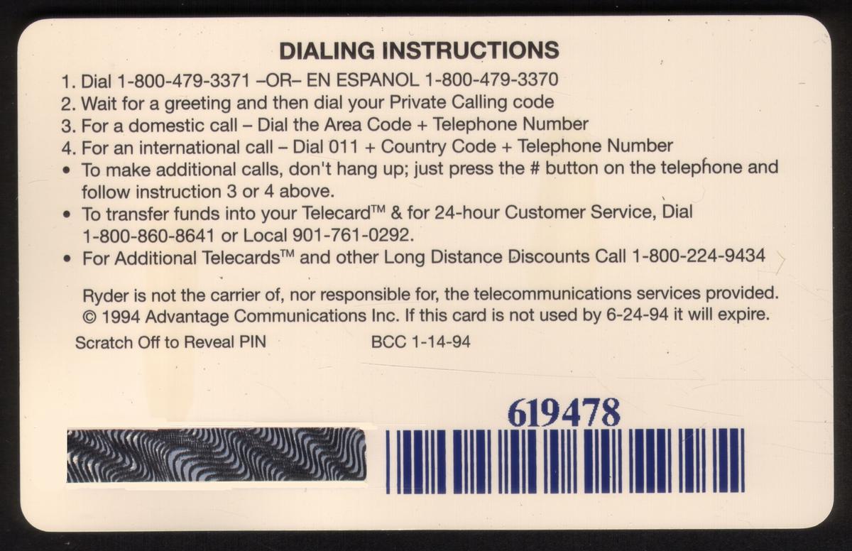
 EasyCall Thin, Blue Barcode")