|
Vintage 1995 Telephone Calling Card from the Expo, featuring Ebetts Field Bronx scene, historic architecture, advertisements, and detailed usage information. |
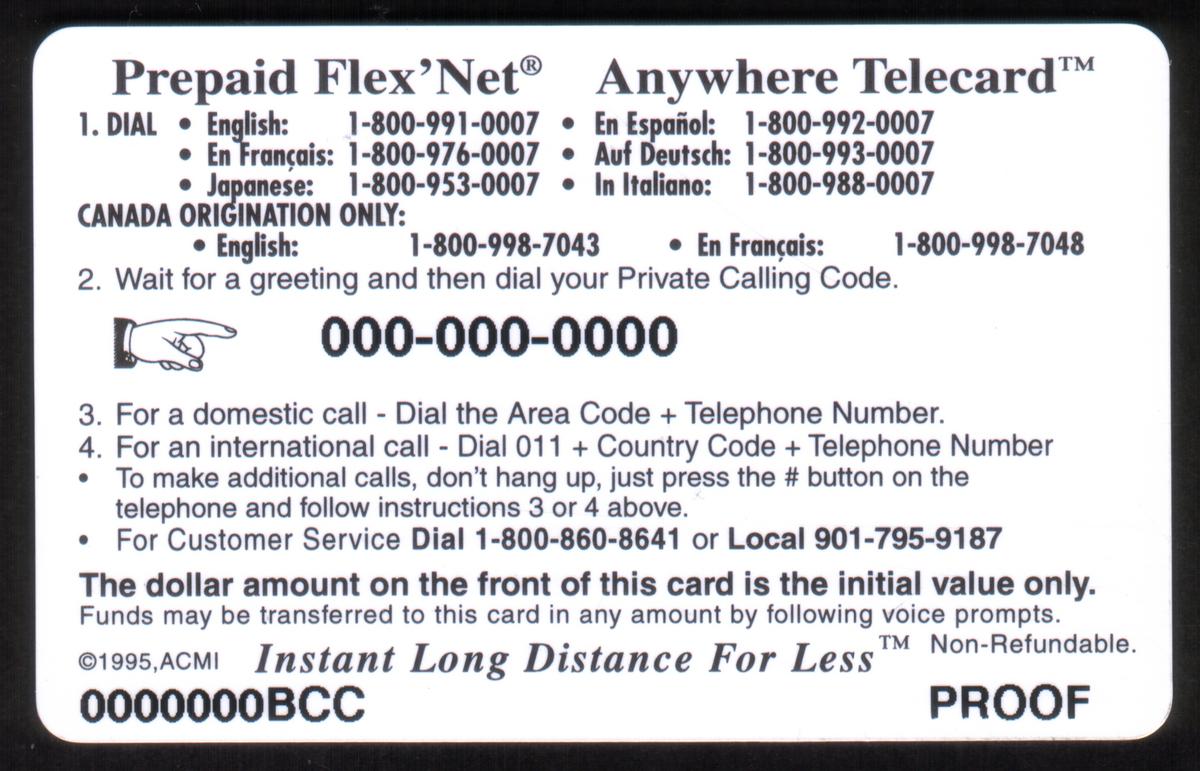
$6. Ebetts Field: 'Bronx' New York & Show Card (03/95) (B+W) 'PROOF'
Add to Cart
Click on any image to view a larger version.
| SKU |
|
Mfg |
|
Issued |
|
Price |
|
| 20833 |
|
ACI |
|
Unknown |
|
$11.99 |
| $6. Ebetts Field: 'Bronx' New York & Show Card (03/95) (B+W) 'PROOF' |
Description:(This description is AI generated and may contain inaccuracies.)
This collectible telephone calling card features a black and white photograph of Ebbets Field, located in the Bronx, New York. The image showcases the exterior of the historic sports stadium with its curved brick facade and multiple arched windows. Prominent advertisements for Philip Morris and Seagram’s are clearly visible on signs attached to the building.
The card displays the price "$6.00" along the left side and indicates the event date "March 25 & 26, 1995" vertically on the right edge. The words "Telephone Calling Card Expo" appear at the top of the card in bold text, while "EBETTS FIELD, Bronx, New York" is printed at the bottom. The logo "ACMI" is also present on the right side of the card near the photograph.
Additional details include a parking sign specifying hours, "8 AM — 11 AM, TUES, THURS," positioned prominently in the upper left quadrant of the image. The overall design highlights both the venue and its advertising during the period, preserving an Americana sports and advertising theme connected to baseball culture in New York.
Since we have the world's largest inventory of USA phonecards for collectors, you will not necessarily receive the identical serial/batch/PIN number that we have scanned/pictured.
|
Keywords:
Sports: Baseball, NY, adverts, advertisements, Philip Morris, Seagram's, trademarks, logos, americana, sports stadiums, brooklyn, ebbetts, ebbets, ebett's, ACMI
|
|
|
 (B+W) 'PROOF'")