|
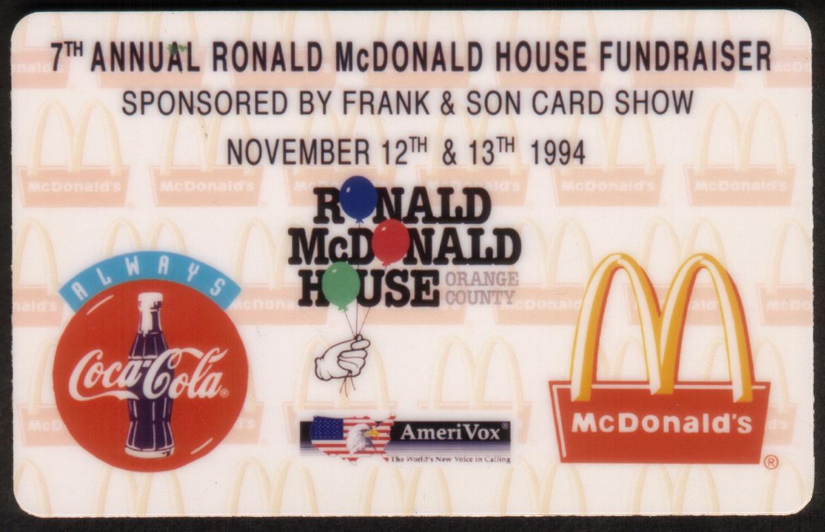
Promotional item from 1994 Ronald McDonald House fundraiser featuring McDonald’s, Coca-Cola, and AmeriVox logos, highlighting charity, branding, and nostalgia. |
1994 Ronald McDonald House & Coke Frank & Sons 'Orange County' PROOF
Add to Cart
Click on any image to view a larger version.

| SKU |
|
Mfg |
|
Issued |
|
Price |
|
| 24530 |
|
AVX |
|
Unknown |
|
$140.00 |
Description:(This description is AI generated and may contain inaccuracies.)
This collectible phone card features a collaboration between Ronald McDonald House and Coca-Cola. The card highlights logos from both Coca-Cola and McDonald’s, including the iconic Golden Arches. The design includes colorful balloons, enhancing the festive and charitable theme linked to children’s charities and fundraisers. The card is associated with the 1994 Ronald McDonald House & Coke event held at Frank & Son Card Show in Orange County.
The front displays the official Coca-Cola and McDonald’s logos prominently. It also includes text identifying the Ronald McDonald House Orange County location. The card references the collaboration with AmeriVox, a known producer of collectible phone cards. This collectible represents support for non-profit organizations focused on children and families.
The imagery and logos reflect the partnership of major fast food and beverage companies supporting charitable causes. This card commemorates the fundraising efforts tied to Ronald McDonald House and Coca-Cola, emphasizing community involvement and philanthropy in Orange County during 1994.
Since we have the world's largest inventory of USA phonecards for collectors, you will not necessarily receive the identical serial/batch/PIN number that we have scanned/pictured.
|
Keywords:
coca-cola, McDonalds, McDonald's, Golden Arches, fast food chains, restaurants, Coke logos, Coca Cola logos, children's charities, fundraisers, non profits, balloons, frank & son card show, ronald mcdonald house orange county, AmeriVox
|
|
|