Description:(This description is AI generated and may contain inaccuracies.)
This collectible phone card features an image of the Kent State University campus. The foreground shows a garden area with vibrant red and orange flowers and green foliage. Behind the garden, there is a distinctive multi-level concrete structure with steps and water features, likely part of the campus landscape or a fountain. In the background, there is a large, curved building with multiple windows and a set of stairs leading up to the entrance. Several people are walking or standing around the area, visible near the building and the stepped structure.
The card has text indicating a calling value of $5 in yellow. The bottom right corner displays the Kent State University logo in blue, with "Kent" in stylized large font and "STATE UNIVERSITY" printed beneath it in smaller uppercase letters. This card was issued by ASC Telecom and is related to education and the college campus environment.
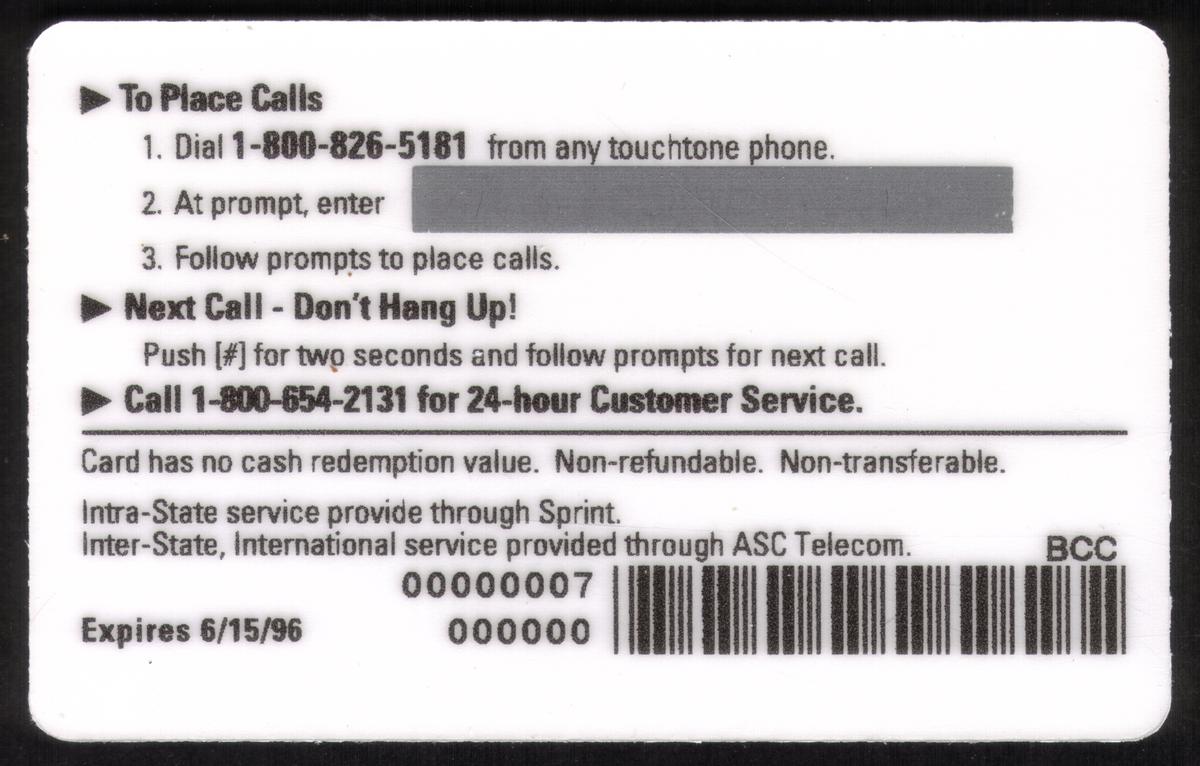
This card is a specimen collectible issued by ASC Telecom, commemorating Kent State University and its campus. It serves as a user card for phone services, with a clear connection to the institute of learning.
Since we have the world's largest inventory of USA phonecards for collectors, you will not necessarily receive the identical serial/batch/PIN number that we have scanned/pictured.
|