Description:(This description is AI generated and may contain inaccuracies.)
This collectible phone card features a vibrant front design that prominently displays a bright yellow Ryder moving truck against a tranquil, expansive beach backdrop. The truck is positioned slightly off-center to the right, with a clear blue sky blending seamlessly into the horizon, evoking either early morning or late afternoon lighting. The box truck model highlights Ryder’s role as a provider of both local and long-distance moving services. The bold black "RYDER" logo stands out vividly on both the side and top of the truck's cargo area, reinforcing brand visibility. A glossy reflection of the truck cast on the wet sand below adds visual depth and realism, creating a striking and engaging image.
On the left side of the card, the word "EasyCall" is printed vertically in a large, elegant font with a subtle metallic sheen. This design element subtly frames the scene without overshadowing the bright, straightforward imagery of the Ryder truck. In the top right corner, the ACI logo, "Advantage Communications, Inc.," appears in smaller white text, indicating the card’s issuer. The bottom center features the number "20," denoting the card’s preloaded unit value for telephone usage. This number is printed in a clean white font that contrasts well against the darker, reflective beach area, ensuring easy visibility at a glance.
Overall, the composition skillfully balances commercial branding with a serene natural environment, lending the card an approachable yet professional aesthetic. This visual harmony serves as an effective marketing tool, symbolizing reliable service through the sturdy Ryder truck while suggesting effortless communication via the "EasyCall" branding. The juxtaposition emphasizes both the practical utility of the prepaid phone card and the trustworthy image of the brand, inviting collectors and users to appreciate it beyond mere functionality.
In summary, the front design is clean yet impactful, blending corporate identity with gentle, natural photography to create a memorable and visually appealing image. The focus on the recognizable Ryder truck underscores themes of convenience and mobility—qualities inherently associated with prepaid phone cards and telecommunications.
Turning to the back side of the card, the design adopts a more functional, information-oriented approach, presenting essential details for usage and terms. At the top, a small block of text outlines instructions and limitations, including accepted areas, access methods, and any restrictions related to time or location. This provides users with clear, straightforward guidance to get started without confusion.
The middle section features a scratch-off area, typically containing a confidential access code or PIN needed to activate the phone card’s units. This code is revealed by carefully scratching away a silver coating. Adjacent to or below the scratch-off section, there are spaces for customer service contact numbers or website information, facilitating assistance if needed.
At the bottom of the reverse side, additional fine print details include terms and conditions, expiration dates, and warnings against misuse or fraud. While small and dense, this legal information is essential for protecting both the issuer and the consumer. The overall layout ensures that all practical details are clear, organized, and easily accessible.
Together, the front and back of the card combine form and function—where the front serves as a collectible piece of brand imagery, and the back provides the necessary operational details to make the prepaid phone card practical and user-friendly for everyday telecommunications needs.
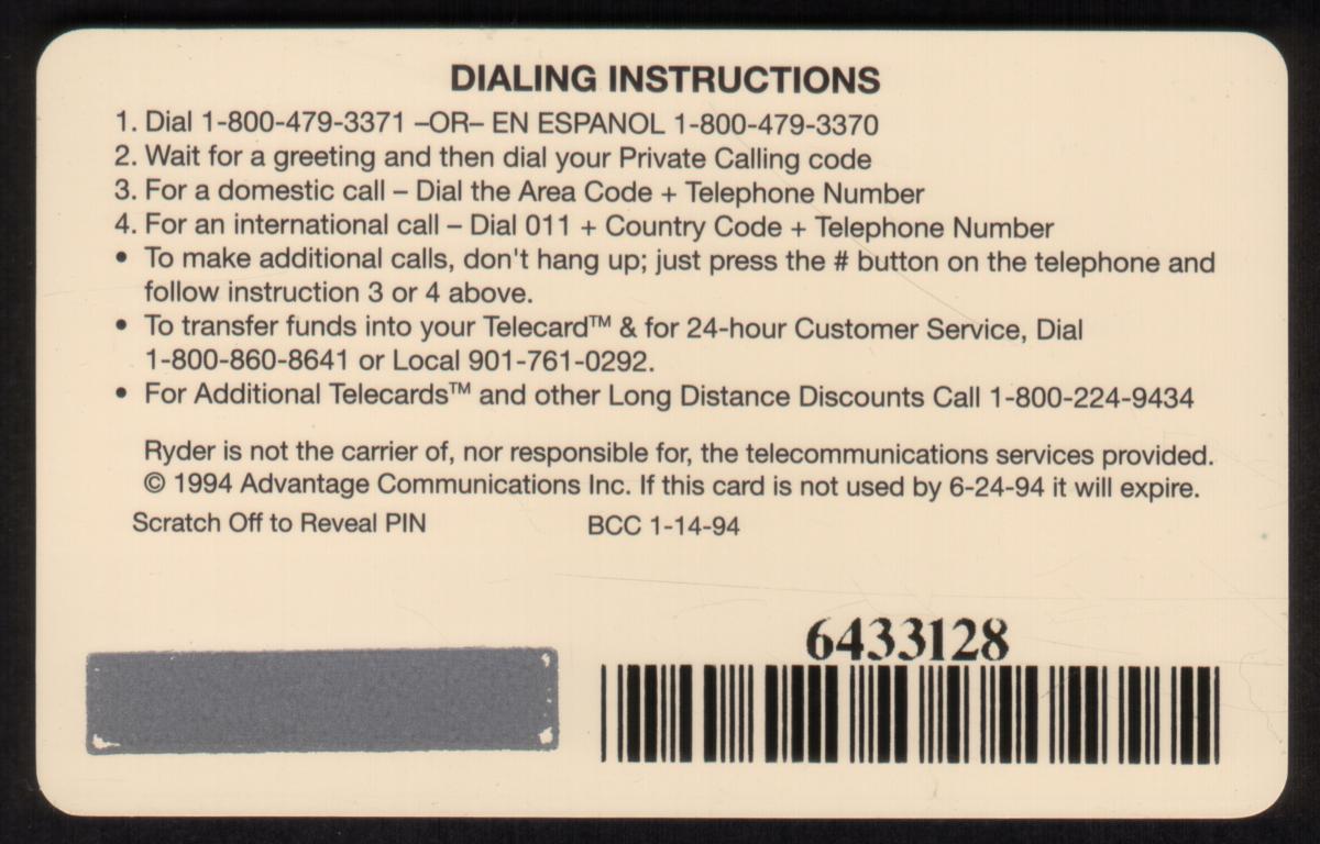
Since we have the world's largest inventory of USA phonecards for collectors, you will not necessarily receive the identical serial/batch/PIN number that we have scanned/pictured.
|