Description:(This description is AI generated and may contain inaccuracies.)
This collectible phone card features a deep blue marbled background with gold and red accents. The top left corner displays the red and gold "ACI" logo, which stands for Advantage Communications, Inc., accompanied by the phrase "ANYWHERE TELECARD™" in gold lettering directly below it. Centered near the middle of the card is the serial number "4324/5000" printed in silver, indicating this card is a limited edition within a run of 5,000 pieces.
On the right side, oriented vertically, is "$3 TELECARD" in bold gold text, specifying the card’s value. Beneath the serial number is the slogan "Instant Long Distance For Less" in italicized gold letters, followed by the tagline "Only the Uninformed Business Pays Full Price™" in smaller gold text directly underneath. The overall design uses a strong contrast of colors to highlight the card’s branding and promotional message for cost-effective long-distance communication.
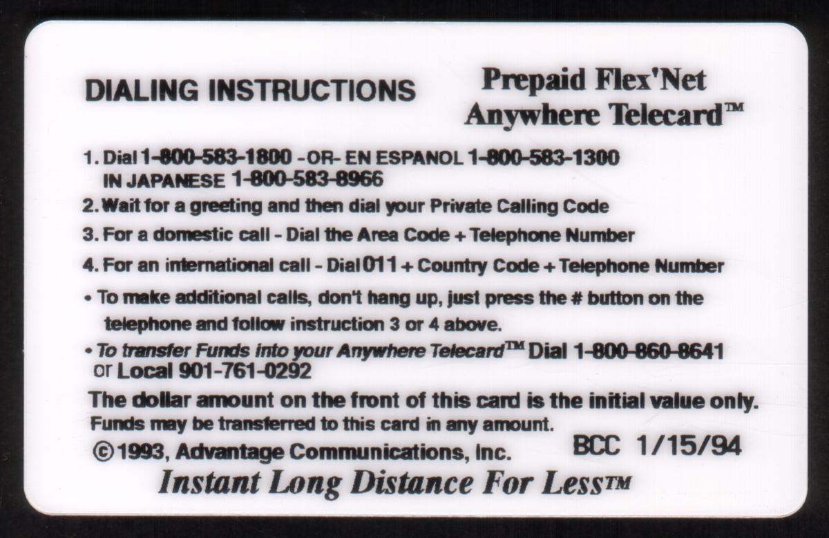
This Advantage Communications, Inc. Anywhere Telecard is a prepaid long-distance calling card valued at three dollars, designed for economical usage. The card clearly communicates its function as a telecommunication product while emphasizing savings for business users.
Since we have the world's largest inventory of USA phonecards for collectors, you will not necessarily receive the identical serial/batch/PIN number that we have scanned/pictured.
|