Description:(This description is AI generated and may contain inaccuracies.)
This collectible phone card features a dark green marbled background with a subtle textured pattern. At the center, the card prominently displays the acronym "ACI" in large, bold red letters with horizontal golden stripes extending from the letters to the right edge. Below "ACI," the full name "Advantage Communications, Inc." appears in smaller, gold-colored text. Beneath this, the words "TEST CARD" are printed in uppercase gold lettering, centered on the card.
The design uses a clean and professional layout with a restrained color palette of green, red, and gold. The overall presentation emphasizes the corporate identity of Advantage Communications, Inc., making this card clearly recognizable as a specimen test card issued by the company. The card serves as a collectible piece linked to Advantage Communications, Inc. and its telecommunications services.
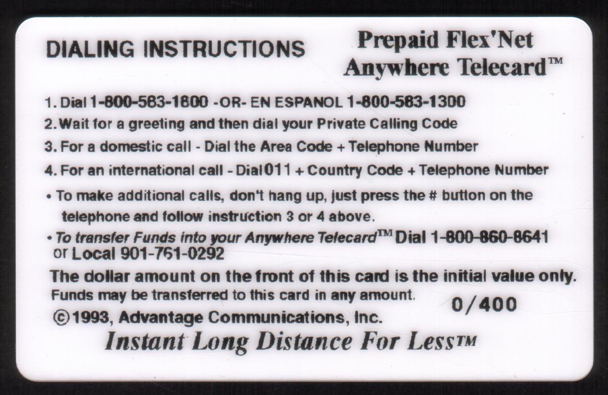
This card is associated with multi-level marketing and prepaid services under Advantage Communications, Inc., including prepaid flexnet and instant long-distance options. It is identified by terms such as "Corporate Test Card," "Green Background," and "SPECIMEN," confirming its purpose as a demonstration or sample card rather than a card intended for regular consumer use.
Since we have the world's largest inventory of USA phonecards for collectors, you will not necessarily receive the identical serial/batch/PIN number that we have scanned/pictured.
|
 SPECIMEN")