Description:(This description is AI generated and may contain inaccuracies.)
This collectible promotional card features a white background with text and logos primarily in red, blue, and black. In the upper right corner, a rectangular label contains the words "BUYERS ONLY" in white text on a red diagonal banner paired with "REAL ESTATE" in black uppercase letters on a white background. Below this, centered text reads: "Finally . . . . . . . A Company that Represents Only Home Buyers!!!" The word "Only" is in red with a blue underline, while the rest of the sentence uses a combination of blue and red fonts.
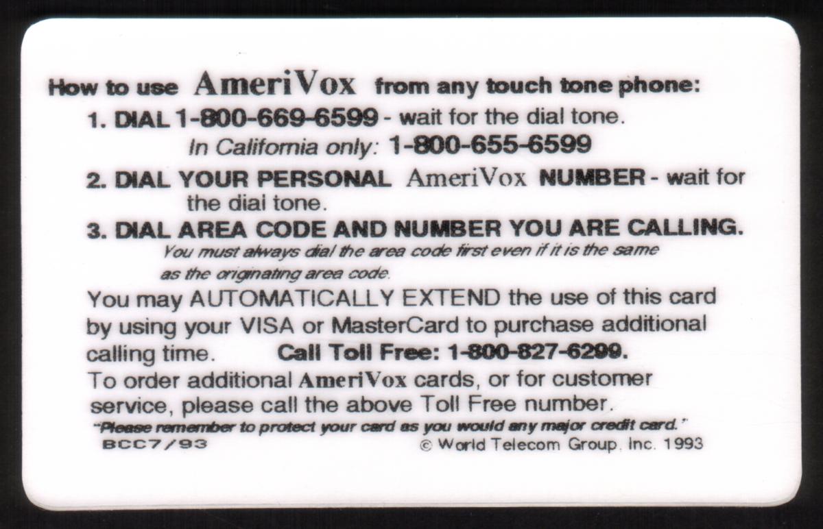
The lower left section includes a phone number in black: (310) 390-2345. To the right of the phone number, there is a small logo featuring a stylized American eagle on a background of the U.S. flag, next to the text "AmeriVox" in white on a dark blue rectangular shape.
This card relates to promotional material for Buyers Only Real Estate, a company based in Los Angeles, California, specializing in representing home buyers. The date reference on the image is July 1993, positioning the card as a vintage promotional collectible tied to financial and real estate services.
Since we have the world's largest inventory of USA phonecards for collectors, you will not necessarily receive the identical serial/batch/PIN number that we have scanned/pictured.
|